
Unit 10 - Identifying Audiences
In this unit I will be exploring what it means by different audience groups, and how to appeal to their demographic through advertising.

Terms and their Definitions
LGBTQ+/ Gender
an actonym meaning 'lesbian, gay, bisexual, transgender and queer or questioning - these terms are used to identify a persons gender identity or describe a person's sexual orientation
Marital Status
whether a person is married or not. This is asked mainly on offical forms with options 'married, single, divorced or widowed'
Socioeconomic Status
the combined measure of a persons economic and sociological position to determine a persons work experience, financial state and social position in relation to others
Psychographic Status
to break down customers into groups in relation to their beliefs, morals and reasons for being
Geodemographic Status
taken from a pooled profile of the specified area, this status estimates the most probable characteristics of the people.
Further Terms and their Definitions
Slogan
a memorable phrase used to stick in an audiences head so they remember your brand or product
Logo
a symbol or small design used to identify products, brands, uniforms, vehicles, et cetera
Endorsement
to support something. in advertising - an influencer being paid to support a brand would be an endorsement
U.S.P
unique selling postion. this is a technique used to influence your audience into thinking your product is superior to the competition
Hard Sell
the intention to get your audience to buy your product fast, rather than consulting different sources and hunting for a better deal
Soft Sell
when the advertising techniques are more calm, casual, subtle and persusasive
Icons
a picture, image or other representation that is used to identify a product and generate attention
Product Demonstration
when the selling point is demonstrated to the audience before purchase to persuade them to buy it
Persuasive Language
using smart vocabulary to manipulate your audience into thinking they need or will benefit from having your product
Mode of Address
how the advertiser speaks to the customer and involves them
Technical Codes
subconcious messages hidden under the surface but still influence your audience
Audio Codes
concerns everything that can be heard, such as background noise, voice-over, music, dialogue, sounds, and sound effects


Nike:
Adidas:
Porsche:
BMW:
Pepsi:
KitKat:
Monster:
https://www.youtube.com/watch?v=eGUor824a74&ab_channel=SportsOnScreen
https://www.youtube.com/watch?v=V_ozu_7Xweg&ab_channel=adidas
https://www.youtube.com/watch?v=O5c93RDGLn8&ab_channel=Porsche
https://www.youtube.com/watch?v=DXUWFmWF7tk&ab_channel=UwBMWDealer
https://www.youtube.com/watch?v=ibmKPnJU-5U&ab_channel=PepsiGlobal
https://www.youtube.com/watch?v=tPaPrLuXcQI&ab_channel=worklikeamachine
https://www.youtube.com/watch?v=aiREY50g-yw&ab_channel=hypotheticalmonkey
Extended Analysis
From my research of how to engage with an audience in advertisements, I have found that socioeconomic grades, gender stereotypes, and how they are translated during an advert (A.I.D.A) are very important.
The first advert I am going to extend my research on is Nike. It is obvious that this advertisement is directed towards teens as the protagonists in the ad are young men playing football. The storyline included in the video shows the teens pretending to play like professional footballers. With help from editing, these teens become the professional footballers they are pretending to be which sends a message to the audience that if you buy the Nike products, the same feeling will be transended through them too. However, this fantasy element and childish pretending tells me that this advert is definetly targeted towards teenagers. Nike as a whole is a very gender exclusive brand, however in this advert, there is a male dominated enviroment and the only woman shown is sexualised by blowing a kiss and other gestures. This supports my claim that the commerical is aimed towards straight men, as this would appeal to the stereotypical male fantasy. I have infered that the socioeconomic grade of this advert could be C2, D or E. I decided this because the protagonists in the video are teenagers who are more than likely still in education - much like the target audience.
In the Monster Energy commercial, there is both a male and female protagonist. This straight away shows us that this product is not gender exclusive and is intended for everybody to purchase. Taking inspiration from what looks like a Star Wars esque universe, this sci-fi element makes the advertisment extremely memorable and familiar to fans of similar sci-fi movies - which is primarily teenagers or adults in their 20s. The female protagonist morphing into an alien-like creature during the end is something that people would remember and talk about - providing free publicity through conversation. Another memorable feature of this advertisement is the female urinating standing up like a male. This stereotypically would have been very surprising and shocking to many viewers of this ad. This possibly controversial element creates another talking point in the advert which generates free and longer lasting publicity through conversation. Similarly to the Nike advert, I think the socioeconmic grade of this advert could be C2, D or E. I have come to this conclusion as the sci-fi cadence attracts the target audience of teenagers would still be in education. Meaning their income is low, and their status on the socioecomic scale is low.
The KitKat ad is targeted towards a slightly older audience, and maybe a lower socioeconomic grade. We can infer this by the protagonist being older, and the job he is situated in being at a supermarket on the cashier. Stereotypically this job is not very high up in society which leads me to believe the target audience for this product is the lower middle class or C2. There is a text break during this advert which says 'working like a machine'. This indicates that this product is aimed towards hardworking adults in less enjoyable jobs. The slogan 'take a break' follows this, and makes the audience feel as if their product is refreshing and almost mandatory into having a good break at work. I feel as if gender in this advert isnt relevant as anybody can work at a supermarket or similar jobs which this advert is showcasing - however, the protagonist is a male. This may mean the advert subconsciously appeals to men more, but I dont think this is enough to put a female or other LGBTQ group off of the product.
Short Composite Advert Task
My Concept Brand : 'Three MUSKeteers"
Price : £30
Target Audience : 17-20
Psychographic :Explorer, Aspirier, Suceeder
Socioeconomic Grade : C2, D
Marital Status : Single
Gender/LGBTQ+ : Straight Men

'Musketeer Regular' font.
abcdefghijklmnopqrstuvwxyz
ABCDEFGHIJKLMNOPQRSTUVWXYZ
1234567890.

.jpg)
A.I.D.A :
When it comes to posters and visual creation in general, I like to take on the approach of 'less is more'. I feel as if as more simplistic and minimalistic is best when it comes to creating posters for products like this. This is why I took the main colour scheme as black and white. Two contrasting shades that compliment each other perfectly. Not too complicated and not too much for the audience to comprehend. With the title, I decided to capitilise 'MUSK' in musketeers to emphasise the scent of the product. I have invisoned the aftershave has a very earthly and woodsy smell, and by taking emphasis to this lets the audience know that before purchasing. However, with this, I added a memorable pun of the 'three musketeers' based on the historical novel. The three musketeers were swordsmen, which influenced the logo creation on the front of the bottle, and also the slogan. The catchphrase with this product is that when you use this aftershave, you become and strong, brave, and heroic as the three musketeers the user and becomes a solder themselves. The font I used is simply called "Musketeer Regular" which was found by searching for an olden, but not difficult to read font. I believe this gives the product a very classic look and would appeal to the desired audience. In a video advertisement, I would go for a more comedic approach to capture the attention of the immaturity of my target audience. I would continue to play on the pun of the historic swordsmen and make the comedy in my advertisment bad, yet memorable because of this.

Broadcasters' Audience Research Board


BARB, or the Broadcasters' Audience Research Board, is an organistation dedicated to compiling audience measurement and television ratings in the UK. This is done by completing surveys and taking interviews to collect data that represent the viewing behaviour of the UK’s 28 million TV and broadband-only households.
This is done by quantative and qualitative questions.
Quantative questions are easier to measure and easier to answer. Using a larger quantity of questions gathers more, but less detailed data. These answers should be based on facts.
Qualitative questions are more detailed and provide less but more valuable data. These answers require a 'why' and take a more open-ended approach which gives resp0nders the space to provide greater detail. These responses are harder to analyse because they rely on opinion, and not hard numbers.
I took a BARB household survey and based off my answers, the Research Board, finds out a lot of data about my behaviour with TV, and how to market to get my attention. More specifcally, my out of the house hobbies, how much money I spend on different categories of products, my drink habits, an estimate on the wealth of my household, where I normally shop for groceries, employment status, my radio listening, and how much time I spend on computers and smartphones and other devices.
From my results, BARB can infer that my household is not the richest, by the fact there has been no holidys inside or outside of the UK in the past year, I spend minimal on only clothing and games, I shop at mainstream, middle-class grocery stores, and also that I am in full-time education. This means that BARB shouldnt target expensive brands and products to my household with hopes of getting a sale. Alternatively, advertising better deals and cheaper brands would create more sales and traction. BARB also knows that I would not be attracted by adverts on radio , as I have not listened to any radio stations in the past 7 days.
From this survey, it is learnt that the way to gain my attention is by placing advertisements on social media, online shopping websites, and physcial marketing like bilboards and posters as I am outside a great deal during my hobbies and college - these are the main sources or traction that I will see and look at.
Because of Lockdown Restrictions due to COVID, filming will not take place and this project will be adapted.
The unit will now include a poster campaign targeted at a specific audience for the brand/product we were aiming to create the TV advert on.
Alternatively I will start pre-production tasks to create an effective adveritsment in the form of a poster campaign.


Moodboard of existing Converse Posters
I have collected multiple images of existing posters for my chosen brand Converse. Lightly analysing these posters, we can see that the brand takes a very streetwear orientated approach - which makes sense considering their target audience. Bold colours are used to bring the poster to life, and large text is used to pull the reader in closer and grab attention. Some approaches are loud in the colour and images they perceive - however many are alternatively grey-scale, and more intricate with the words on the page. These alternate posters are ideal for audiences that you already have the attention of. They work well in magazines or large scale bilboards, so that the text still adds pop. My favourite advert in this moodboard is the first one with the gum grabbing the shoe. This metaphor shows that everybody is trying to get their hands on the shoe, and it tells the audience that this shoe is trendy as of this. I really like the involvement with the gum as stepping on gum in common when walking around. It makes sense within the context of the composition. It isnt out of place. Also in this shot, they captured the logo of the brand perfectly, along with the shape of the shoe. The dark colours bring a grungy cadence to the poster which adds streetwear-like stylisations too.


These 3 posters for example share visual properties in the colours, borders, text, font, layout and imagery. These stylistics effects are a reoccurring in these posters, and will make the audience think of the brand instantly when they see these shared visual techniques. By seeing these similarities, we associate them with the brand they advertise, therefore capturing the audiences attention instantly and pulling them in with the large tag-lines. These adverts in particular have reoccouring shades of red, white and black. This is suitable as these are the main colours of the Converse logo. They also include large images of the iconic shoe itself, to further grab the audiences attention to the advertisment. The bold shapes and border make the poster come to life, and the text within these shapes become more prominent because of this.
My Concept Designs

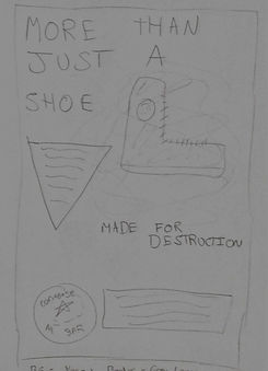

I plan to create these posters with heavy influence from the existing three above. I will recycle slogans and tag-lines to create an authentic Converse cadence. I invision the background to be a dark yellow with a grey/cream border around them. However this could be subject to change depending on how these colours match with the product images and font. I will use large shapes to make the text more interesting, and I will edit the images with overlaps and modern stylisations to emphasise that the product is trendy and up-to-date. I will make sure the Converse logo is in view on the poster, so that the audience will know instantly what brand my poster advertises. I will experement with background textures, like cringled paper, to give the background more personality. This will look more professional than a solid colour as the background.

As I predicted, the yellow background was too vibrant and was more of a distraction that a feature that would grab the audiences attention. It was more negative than positive. So I have decided to use the dark purple colour that Converse is iconic for. The same colour as the star in the All Star logo.

My Poster Campaign


These images are able to be magnified by simply clicking on then. However if you'd like to download them (.zip) for a better view, then click the following link: http://www.mediafire.com/file/vn96088x3vo8q81/POSTERS.rar/file
Evaluation
After researching existing Converse posters, I saw that there was a lack of streetwear orientated campaigns. I decided to create and compile my project into something that could fill this gap. Considering the desired demographic, this seemed like a very fitting subject topic. My target audience of 12-18-year olds was attracted using classic, well-known colours, streetwear-like designs, and popping text. The graphic elements were taken from official, existing Converse advertisements and recycled for use for my poster campaign. I really like the edited images of the Queen and an adaptation of Mount Rushmore. These bring familiarity to the poster and brings an element of edginess and rebellion as the audience will be surprised to see defaced versions of the world leaders and powerful people. This element will appeal to the teenage demographic as they stereotypically enjoy breaking rules and being different. I believe this is a good marketing scheme to grab the attention of 12-18-year olds and will be very successful in doing so. Alternatively, I would have liked to have taken more time to choose the famous faces on my advert and create the graphic from scratch. Doing this would have expanded the successfulness of my campaign as I would have used faces that are more influential and have more of a presence to teenagers. For example, basketball players, as well as skateboarders would be fitting.
In my original TV advert, I planned to grab the attention of my target audience by incorporating skateboarding. I decided this to be the main element of my advert as it fits the Converse brand and demographic very fittingly. It is also something I enjoy and would enjoy making. For the posters, I would have liked to create more skateboarding-esque print by taking photographs and editing similar to the THRASHER style. However, with restrictions in lockdown, I felt it was irresponsible to capture shots of skateboarders during this time. Alternatively, I created my poster campaign in a broader view, with influence on basketball and streetwear. My inspiration to create with these themes came from the mood board and research into existing Converse poster campaigns. I took heavy influence from stylistic techniques, and poster layouts, content in text - which spoke of the shoe in a basketball context heavily. Other than the research shown above, I decided to draw outlines and basic layouts of how I wanted my posters to look and freestyled the rest. Letting myself be creative. With posters, I always strive for the concept 'less is more'. I tried to make simple but effective designs and tried not to create something overwhelming for an audience. As a consumer in the target demographic, posters with this style are discouraging. A heavily

influenced aspect of my posters are the text. The titles and content in smaller print are all taken from or adapted from existing Converse posters. I decided to recycle these aspects and incorporate them in my work to ensure that I am staying on-brand and creating a product that could fit in with the already existing Converse prints.
I have effectively enforced similarity in my three posters by keeping to a colour scheme of black, white, blue, and red. This colour scheme is very good at capturing the eye and shows heavy attachment to the Converse brand. Within all my posters, I have also ensured they have the exact same width and colour of border. Having a border in my poster makes everything a little bit closer together and makes everything pop a little smoother. As well as this, when printed, it wouldn’t matter too much if the sides are cut off accidentally. The titles are large, bold, and in a very clear and readable font. Specifically, the classic Converse font to stay on brand. I made sure to capture the iconic mottos in this large font so that the audience will know exactly what brand the posters are for in an instant. Another technique I used to ensure the brand stood out is that I incorporated the Converse logo, or an adapted logo in each print. I made the logo very large so that the iconic patch with the star is visible from every angle. It won’t be missed. In the first poster, to add some variety, I created an adapted logo with the word 'Converse' in a very large font, with the well-known 'Chuck Taylor' signature beneath it. Adding these elements grabs the attention of Converse consumers instantly. A technique I used to create a vintage tone to my posters in a texture overlay. The texture gives the solid colours an effect that is like crimpled paper. I added this so that the background was not just a solid colour, and to give the poster a bit of personality. It is simple, small, but effective in improving the aesthetic of my campaign. Next time, I would like to have taken my own photographs of the shoe/product and I would have also liked to have taken larger photos and created something similar to the THRASHER style shown above. These are techniques I will work on outside of these projects and when the lockdown restrictions are lifted.
In conclusion, I believe that my prints are an effective example of a poster campaign with very similar visual aspects, and well-planned general poster conventions. I strongly think that my product will grasp the attention of 12-18-year olds, my desired target audience, and that would encourage the audience to purchase the product being advertised. During this project, I have further developed my Photoshop skills by adding texture overlays and practicing conventions and general techniques. I now have a stronger understanding of target audience, marketing, and how to grab the attention of an audience in a print product. These practices will help my future media endeavours in print work as I will have a head start in research and what to look for when investigating demographics, brands, and target audiences. When next creating print work, I would like to take more photographs of the product and backgrounds for myself, instead of using images from Google. I would also like to create more graphic elements myself and investigate the making of the edgy images of the Queen and Mount Rushmore. However, with lockdown considered, I am proud of this project.